FanUp Inc. Logo Design
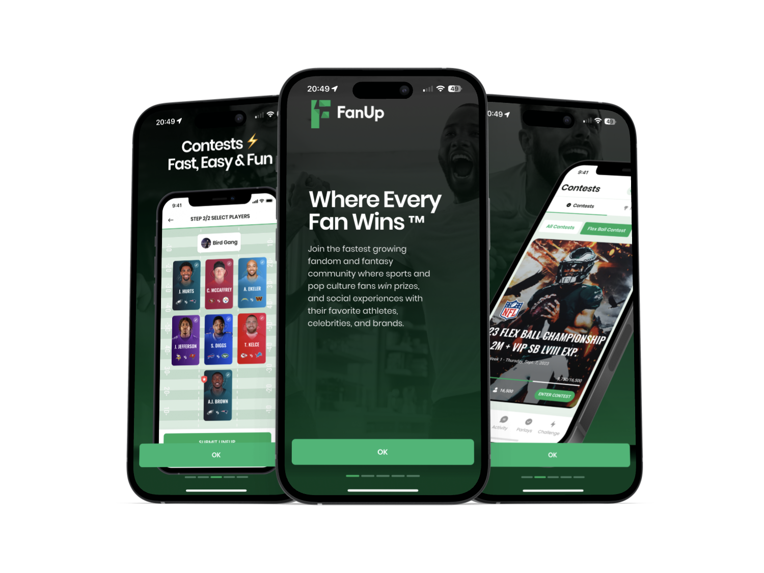
The first globally connected, risk free and skill-based platform for every type of fan - sports, esports and pop culture.
Overview
FanUp is an interactive gaming company that personalizes fan engagement and sports betting with innovative features, data and predictive content.
FanUp hired me to design their brand new logo for their upcoming product launch into the market.
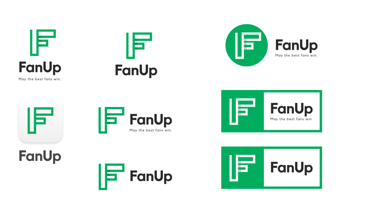
Final Design
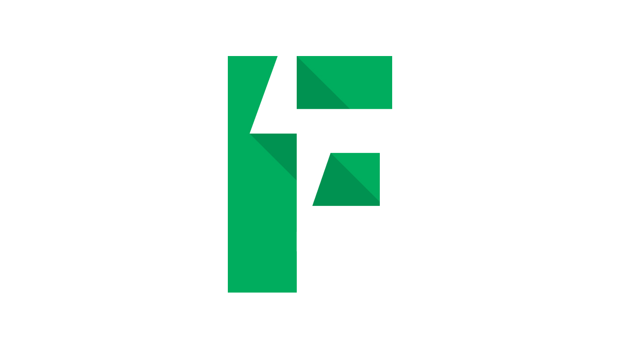
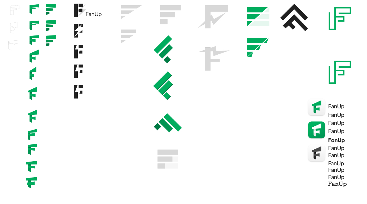
The shape is a strong “F” with a lightning bolt living in the white-space. The bolt connects the letter and draws it up into the sky. This concept portrays challenge, connection, speed and energy.
The main color is a strong green called Jade. This color epitomizes sports and the fields they are played on.
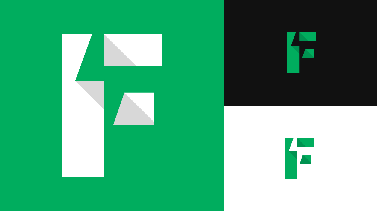
Stylized "F": The prominent use of the letter "F" clearly represents the initial of "FanUp," making the brand easily recognizable and memorable.
Geometric Design: The use of clean, geometric shapes gives the logo a modern and dynamic feel, which can symbolize innovation and a forward-thinking approach. This aligns well with FanUp's focus on providing a contemporary and engaging platform for social gaming and fantasy sports.
Green Color: The choice of green could signify growth, vitality, and energy, which are positive associations for a platform aimed at enthusiastic sports fans and gamers. Green is also a color often linked with success and progress, resonating with the competitive nature of fantasy sports and gaming.
Angles and Shadows: The angular cuts and shadows in the design add depth and dimension to the logo, suggesting a multifaceted and engaging user experience, which is core to FanUp's offerings.
Overall, the FanUp logo combines these elements to create a visual identity that is modern, dynamic, and reflective of its focus on community, competition, and innovation in the social gaming and fantasy sports arena.
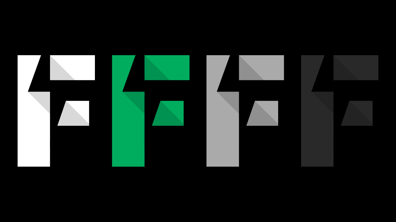
Concepts