Toronto Raptors Mobile App
Role: UX flows, information architecture, interaction design, prototyping, usability testing, and iteration
Overview
The Raptors app had strong traffic but inconsistent engagement. Fans opened the app for scores or tickets, then left. There was no clear agreement internally on why engagement dropped or which experiences actually mattered most to fans beyond game day. The challenge wasn’t adding features, it was clarifying value and reducing friction across core fan journeys.
Result
Fans loved the relaunched app as was evidenced by the month-over-month metrics and, additionally, the redesign also made significant business impact across various business units.


Challenges
Before we could begin the redesign, we had to gather fan sentiment and feedback to understand what was working and what wasn't.
Confusing and unintutive information hierarchy
Lack of up-to-date content and poor visual experience
Outdated aesthetic that failed to keep up with the new team branding
Tech stack severely limited the ability to create engaging fan experiences
Lack of product ownership and governance
Fragmented, inconsistent and limited analytics
Goals
Given the app's central role across both the fan journey as well as the business, various considerations were necessary for success.
Relaunched apps had to have full parity of all the previous apps features
No disruptions to any revenue streams that stemmed from the apps
Update the tech stack and unlock new mobile features
Launch in time for new 2022-2023 season opening night
Test new apps during pre-season games, could not launch opening night without testing
Create dynamic experiences for different fan types through segmentation
Roles + Process
The relaunch was a massive undertaking that involved 5 direct reports, 20+ indirect reports and Front Office approval along the way. Not to mention the relaunch of the Leafs app was happening at the same time to further complicate delivery.
Built and led a cross-functional team including Program Manager, Product Manager, Sr. Product Designer, Jr. Product Designer and UX Researcher
Captured existing metrics and set new UX and Business KPI targets to establish product success
Implemented fan feedback loop which helped inform team backlog, feature delivery and product focus
Managed various vendor relationships, led creative direction and oversaw development efforts
Created, implemented and maintained strategy as well as roadmap for both pre and post app launch
Lead marketing efforts including social, arena billboards and wrote script for player-read promotional videos
Worked with Front Office and all involved business units including Retail, Marketing, Studio, Food and Beverage, Business Intelligence, Global Partnerships, Digital Operations, Ticketing and Memberships
Managed both the working team and the app's budgeting and approval processes
Research
The mobile team spent the entire 2021-2022 season researching and synthesizing how fans used the app so we could uncover opportunities as well as understand issues


Our main research focused around capturing qualitative feedback through user interviews and quantitiative insights through prototypes
Initiated guerrilla research strategy on Opening night to garner insights directly from fans
Feedback loop was broken and fragmented so we created a new feedback cycle that was gathered through the apps specifically
Feedback issues mentioned 10 times were prioritized, outside of bugs, and created our fan feature request backlog
Comprehensive competitive analysis on other team and league apps
The “Carter effect” impact is real
Feature Proposal
After synthesizing all the user research findings we had gathered, we focused on the following:
Rework Information Architecture for better discoverability
Dedicated Video and News sections
Home page is a portal into the rest of the app
Dedicated + tiered “Offers & Promos” and “Games & Contest”
Ticketing now top level nav item
Redesigned profile page with avatar upload, tickets and offers
Harness Content Library + Picture-in-picture Video Features
A lot of content was missing or living on YouTube only
Fans wanted to watch videos but there was very little content
Upgrading the video player to be picture-in-picture so fans could traverse the app and check score or stats but still be watching videos
Promote late breaking news and press conferences
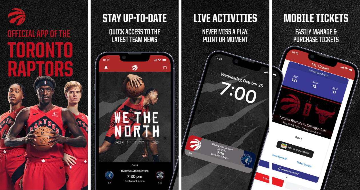
iOS Live Activities
As 75% of our fanbase use iOS, giving them access to one of the latest iOS features allowed them to stay closer to the game with live play-by-play updates directly on their phone's lock screen without the need for push notifications
Segmentation Capabilities
Ability to show and/or hide content based on attributes like Location, Behaviour, Time or Feedback
Ability to send push notifications based on attributes like Location, Behaviour, Time and/or Feedback
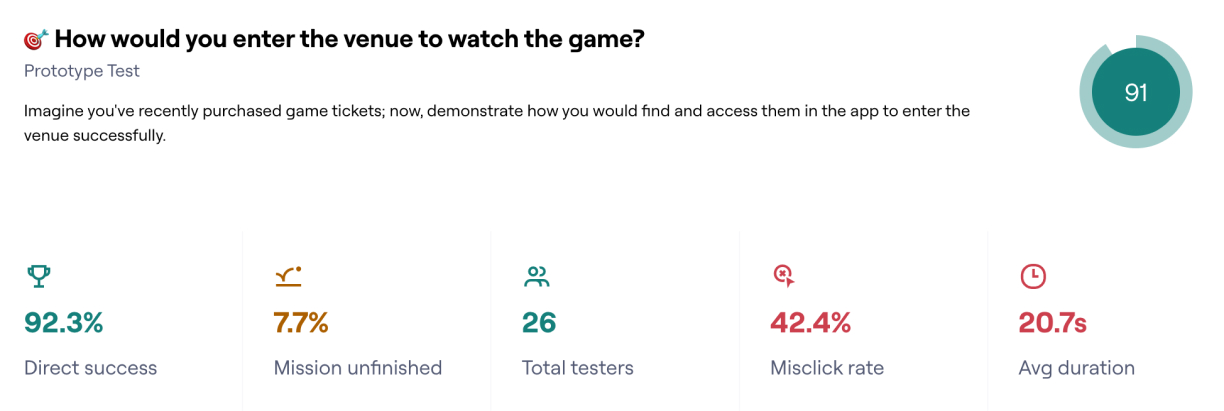
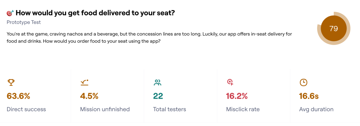
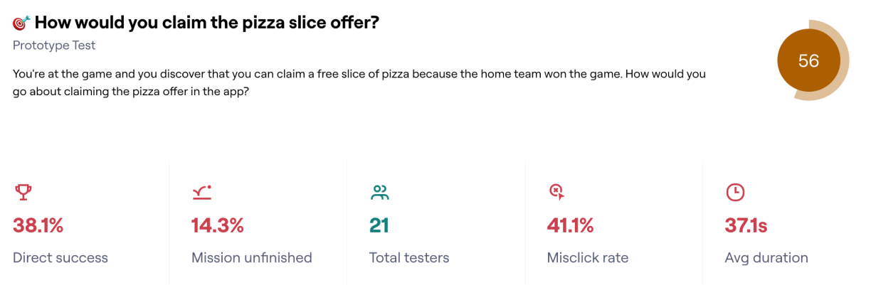
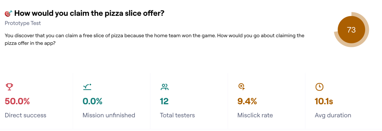
Prototype Testing
Once we had synthesized the data, we started prototype testing to make sure we were addressing the issues we were seeing:

Design
After validating the prototype flows and information architecture, we proceeded to build out the redesigned app.
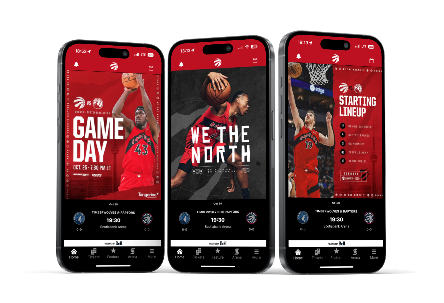
Home
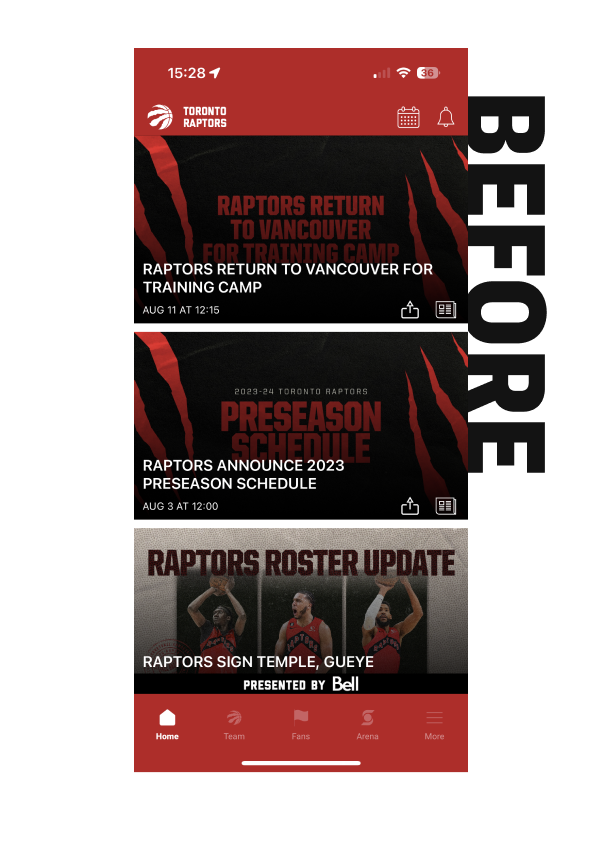
BEFORE - The Home tab housed all content in one extremely long, unorganized page. All content including News and Video was mixed together and it was difficult to navigate.
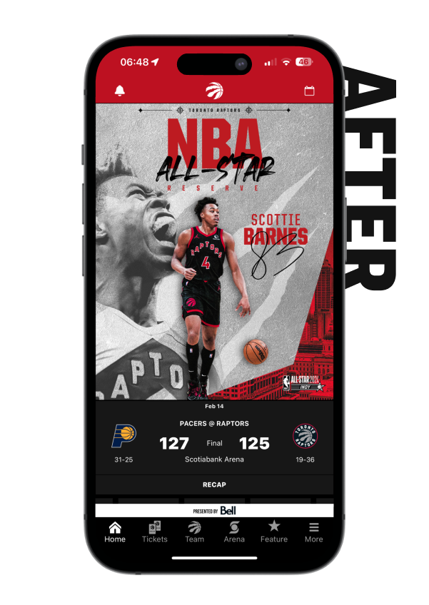
AFTER - The Home page has been optimized to be much more organized and visually striking while also providing fans many more interaction points so that they can dive deeper into whatever they are looking for.
Ticketing
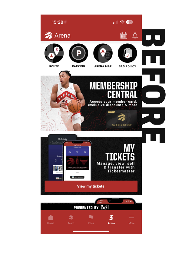
BEFORE - Ticketing was very difficult to find and was randomly placed on the Arena page where it was not intuitive to find at all.
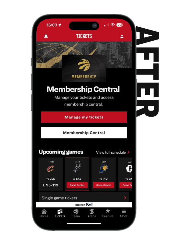
AFTER - Improving fans ability to find, buy, sell and manage their tickets inside the app was imperative so we brought it in to the primary nav. We also added upsell capabilities inside the ticketing section by showing upcoming games.
Roster
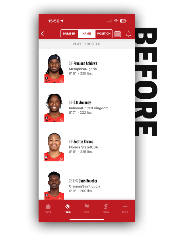
BEFORE - As one of the most used features, we wanted to make sure the Roster and Schedule were easy to find. The previous design was missing a lot of player and team stats.
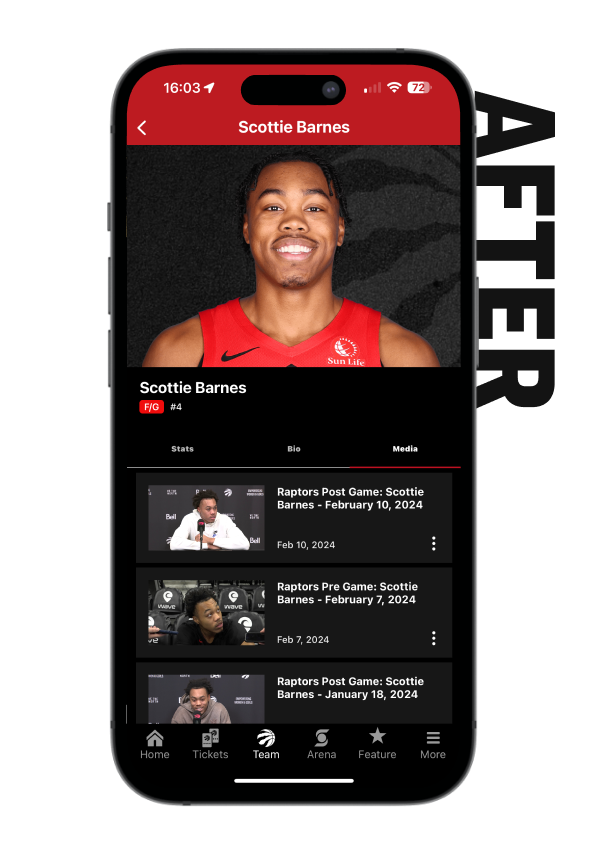
AFTER - The Team section was revamped to have a beautiful entrance page called “Overview” and now displays relevant stats fans would be looking for. There are also dedicated Roster and Schedule tabs.
Video & News

BEFORE - The Home tab housed all content in one extremely long page. All content including News and Video was mixed together and was difficult to navigate.
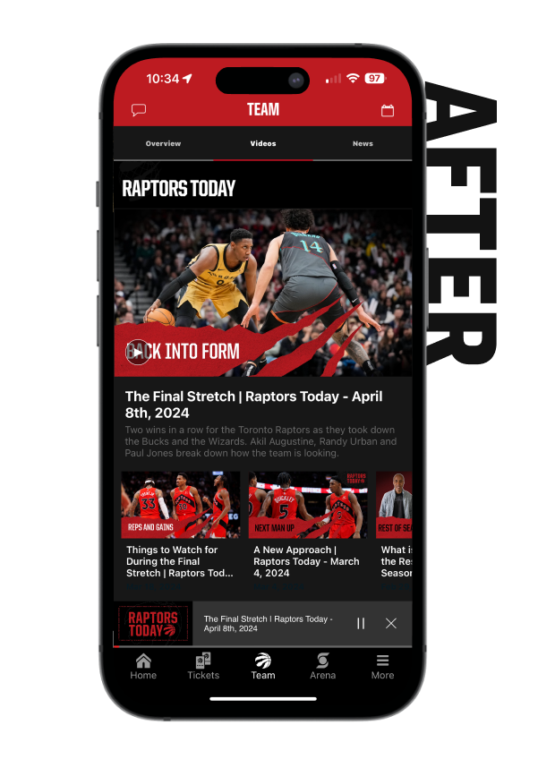
AFTER - Dedicated Videos and News sections make it easier to locate content which is also broken out by series. Additionally, a new video player experience auto-plays next in series videos, has picture-in-picture and full screen experience.
Profile

BEFORE - The Fan tab had become a dumping ground for various types of content from Retail to Offers to Videos. We took this section out and create dedicated sections like Retail and Profile.

AFTER - The new dedicated profile section help create a more personalized experience where fans could choose custom app icons, download wallpapers and select their favorite players.
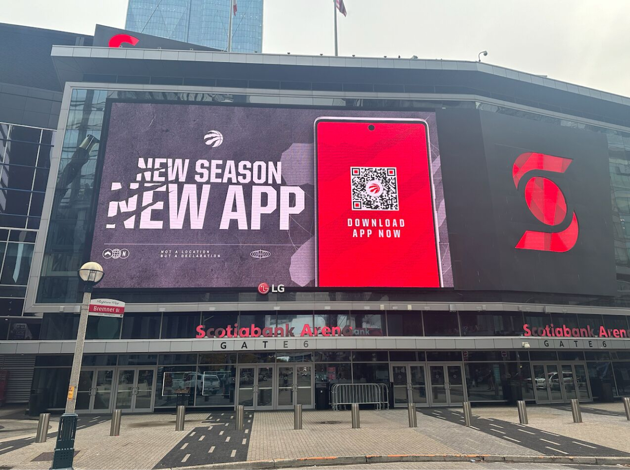
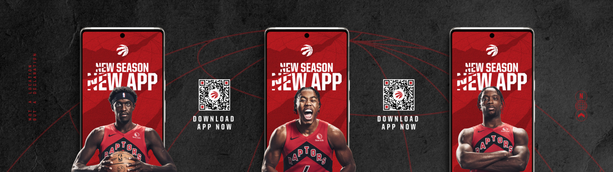
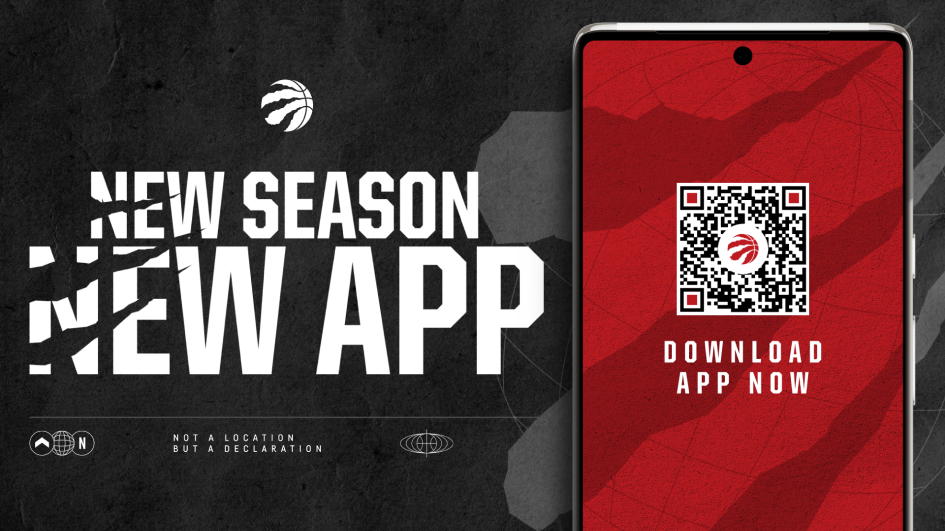
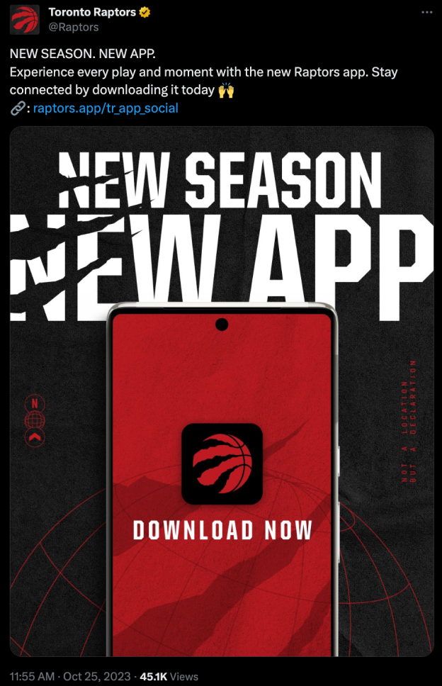
Marketing Launch
After the successful soft launch we rolled out during the preseason, we created and delivered all digital assets to promote the new app for regular season which included all the following assets:
Outcome
After an entire season of researching and an offseason of designing, testing and building, our month-over-month increase in stats was tremendous. More importantly, our fans were super happy with the new app.